(12th SDEEP Devlog) Final Devlog (v0.3 Release)
Hello!
I wanted to do a few things for this devlog regarding tempering the expectations of the Early Access (EA) release.
First off this EA version 0.3 has 6 missions available, furthermore it is designed to do three things:
▓▒░ T1. Get the community and I on the same page.
Direct feedback based on gameplay after every update will be a nice change of pace. I think mostly everyone has what they want out on the table as far as pre-release suggestions. At this point I'll be happy to switch from devlogs to patch-notes.
▓▒░ T2. Get rid of the devlog schedule
The devlog has been great for displaying mechanical ideas, but with most of the mechanics finished there isn't much left I can show besides the game itself. I will be replacing scheduled devlogs with unscheduled updates, I may or may not be announcing updates in the discord server dev-notes channel. These updates will finally be relevant to the players now that I can push them out to the EA build. For quality reasons I don't think these updates will have a schedule this time. Also crunch time is over BUT, now that I'm generally done programming, I no longer have to split my time between programming and art.
▓▒░ T3. Mitigate the drastic difference in planned vs actual release date.
As many of you know project Salvor DEEP was first announced with a total planned development time of 1 month. This was essentially going to be the demo but with several more levels. Restricted to only shipwrecks, and about as much story as Curse of Dares. Which is just enough story to prevent the game from feeling like gallery mode. With the addition of the Shop, different level types, world map, story, etc this dev time is at 3 months now. This is not strictly bad, BUT I made the mistake of allowing preorders with the belief that the dev time was only a month.
I want to move forward with something for the preorder people to play while I'm developing at least.
Secondly I'll mention changes from the demo version to this version:
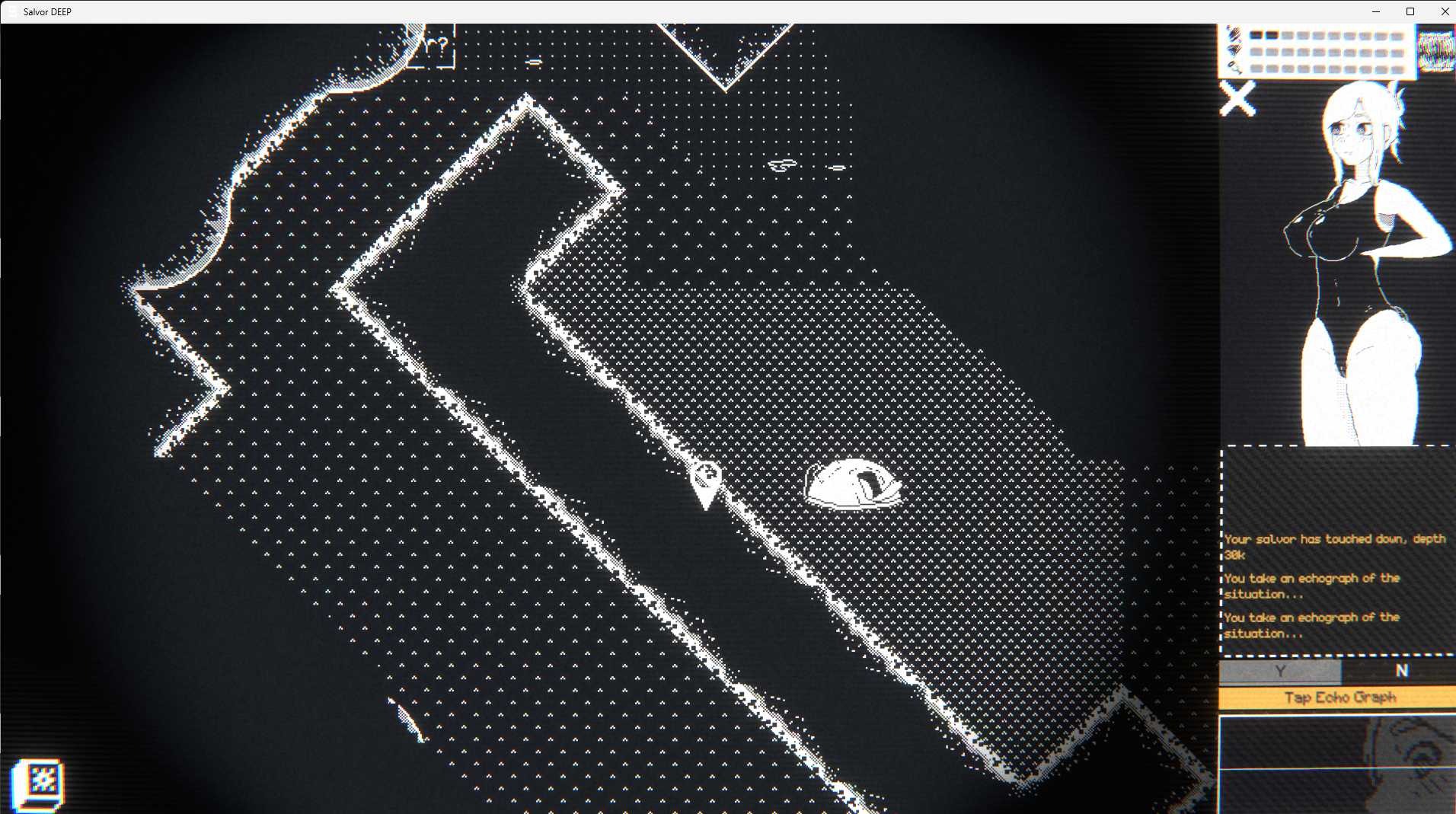
- Status image is displayed on the top half of the chat box showing the current sizes of the salvor.
- Holding down the click button will now redirect her to your current mouse position a few times per second.
- Certain images will now change size based on your salvor's current sizes. (most won't yet)
- There is a shop to buy extra equipment and equipment modifiers
- There is a home that doesn't have much in it yet, that's where the gallery will be when I finish that.
- X and N are hotkeys for 'no' while Z and Y are hotkeys for 'yes'. Space bar and enter key are echograph.
- Auto search has been axed, with the addition of reusable and moving nodes auto-search became a buggy mess that took time to fix. This was not in the demo for similar reasons so ultimately I didn't feel very attached to it.
I will be focusing on bug fixes, new levels, bolstering current levels, and alternative art during this week as I prepare work for my translators.
If you find a bug, you can post it on my discord under the salvor-deep-bugs channel. (https://discord.gg/xERGNU3U)
Currently I've been playtesting the living hell out of the game looking for the worst possible bugs, I plan to release the game in less than 2 hours from now. Then I'm going to take a looooong nap.
v0.31 Available!
Last and least, Steam:
To clear up any confusion, the game will NOT be released on Steam for the near future. But I am still working to get it released before version 1.0. Currently the steam review team has told me that effectively versions 0.3 through 0.6 are not enough to be released on their platform (there ARE ways to get it out before version 0.6 that I'm pursuing as well). To put it in their words (and to save you paragraphs of arguing): 
Get Salvor DEEP
Salvor DEEP
Under-equipped and broke, protect your salvor (or don't) from the various dangers that lurk in these ancient wrecks.
| Status | Released |
| Author | Delusria |
| Genre | Adventure |
| Tags | 2D, Adult, Atmospheric, breast-expansion, futanari, lactation, Mouse only, optional-ntr, Pixel Art, voyeur |
| Languages | English, Spanish; Latin America, Japanese, Portuguese (Brazil), Chinese (Simplified) |
| Accessibility | One button |
More posts
- Small Additions > New Project > Server ReworkJul 12, 2025
- Available on Steam + Steam Keys Available HereMay 12, 2025
- The Summit (v1.00.3 Unstable Full Release)May 01, 2025
- Patch v0.62 (Steam Store Page Announcement)Feb 16, 2025
- Hotfix v0.61Feb 11, 2025
- v0.6 ReleaseFeb 07, 2025
- Progress Report v0.6 (Part 3/3) (Release February 7th)Jan 30, 2025
- Progress Report v0.6 (Part 2/3)Oct 29, 2024
- Progress Report v0.6 (Part 1/3)Sep 30, 2024
- (v0.33.0) Translation PatchAug 27, 2024

Comments
Log in with itch.io to leave a comment.
Someone else had covered other bugs I encountered, so I won't repeat them here. My biggest complaint was that the text on the map was EXTREMELY small, and barely readable. The shop wasn't much better. Definitely should find room to increase the font a little. I didn't have a problem with Salvor dialogue, though.
I also think it'd be worth having colored borders on map icons to say "hey, you can go here". Would make them much easier to see as a whole.
Hey thanks for the feed back! I'll have both of those done for the next version.
bug: going to the 3rd stage I got stuck in the wall and cant get out. happened as soon as i entered the map
Yea that's a big one on the discord at the moment, I'll be getting a fix for that rolled out in the next patch!
Glad you're liking it igniso!
I'll add those bugs to the list, hopefully I can get a hot fix rolled out soon.
Some of those ideas are planned for the next content update. Glad you like the post-mission text as well. Once I get further into the game I think I'll have a few more post-mission and pre-mission conversations as well.
Thank you for playing!
Thanks a lot for adding the shortcuts (: makes life a lot easier
No problem, I hope it works better on the mac version for you!
Thank you! I hope you enjoy 😊